
You’ve spent a lot of time writing your website copy to ensure it’s not missing any information potential customers would want to know. Irresistible benefits. USPs. Interesting educational points. All the nitty-gritty details about logistics. But for some reason (that’s driving you absolutely insane), your conversions aren’t as high as you’d hoped.
What gives?
It’s probably not that your copy is bad. One likely reason is that it isn’t fully obvious. Maybe key points are placed too low on a page, or are buried in sections that don’t get as much visibility. This is where readability comes in. Instead of overhauling the copy itself, you might just need to relook at placement.
You’re in the right place if you’ve been struggling with website conversions despite having a solid base of copy. The following tips will show you how to place your copy so friction is reduced and browsers have an easier time taking action.
What is strategic copy placement?
Strategic copy placement is a pretty straightforward concept. Essentially, it’s placing information in a way that readers can best understand the offer, see its value, resolve uncertainty, or take the next step.
Placing copy strategically can look like …
– Highlighting a key benefit in your homepage’s hero section
– Adding a delivery estimate near the purchase button on a product page
– Including a testimonial or quote next to a claim it supports
– Creating a FAQ that answers objections before a final CTA
The goal is to make sure all vital information gets easily seen, so that potential customers grow more comfortable and confident with the idea of purchasing or taking action with each line of copy.
How to Make Your Website Copy Easier to Find (& Act On)
So, how can you put strategic copy placement in action? Just follow these guidelines!

1. Make the primary benefit immediately visible
Copy should always answer the million dollar question: what’s in it for me?
It’s easy to fall into the trap of highlighting features (18K solid gold! Ultra fine cashmere! Rich shea butter!), but it’s the benefits that really do the selling. Instead, lead with why those features matter. How do they improve someone’s life? Why are they better than other alternatives?
You can absolutely use hooks to draw customers in, but they shouldn’t have to read for too long before understanding what the product is, who it’s for, why it matters, and what problem it solves.
Start with the strongest ones if your product has too many benefits to summarize immediately. You can explain the remaining benefits in other areas of your website.
2. Put practical information near the related action
Online shopping has become very normalized by now, but that doesn’t mean it’s frictionless. Especially when it comes to fashion and lifestyle products. A lot of people are still hesitant to buy something they’ve never seen in person, so you have to work a little harder to make them comfortable.
Hyping up the product or offer in its description isn’t enough, unfortunately. If you’re selling ready-made products like apparel and accessories, be sure to include information like shipping costs, processing and delivery times, and return policies upfront. As in, on the product page. Not buried in a policy page that can only be found at the footer of a website in a tiny font.
If you’re selling multipacks or kits, include absolutely everything included within them. Break down the process if you’re selling something that requires a bit of DIY-ing. Let’s say you sell press-on nails. The product page should explain what comes with the nails (does it come with spare nails? A cuticle pusher? Nail file? Glue or sticker tabs?), the step-by-step process of how to apply the nails, and, for an added bonus, approximately how long application should take. Someone who has never tried press-ons might be hesitant without the right information. But if you let them know they can create a salon-quality manicure in under 10 minutes and they’ll be provided with everything they need to make it happen, they’ll be more likely to take a chance.
And what if you’re selling a service? Explain exactly how it works on the sales page. What steps will the customer need to take to make it happen? How long will it take, or how much time is required on the customer’s end? Who’s eligible to apply?
Think about the customer journey, and which questions will pop up. Then place your copy accordingly. The little details might not seem as interesting as the benefits, but they play an integral role in customers taking action.
3. Use specific information instead of making readers interpret vague statements
Above we spoke about reducing friction. Now it’s time to reduce mental load.
We live in a busy world, and your customers are constantly being bombarded by content. They don’t want to do even more work to figure out what you mean in yours.
Luckily, all you have to do is be specific. For example:
– Instead of saying you offer “fast shipping”, tell customers when they can expect their deliveries (ie. “orders leave the studio within two business days”)
– Instead of promising “regular newsletters”, explain readers will receive “advice & insights in your inbox every Thursday”
– Instead of saying a customer will receive “a personalized experience”, explain that “a team member will work with you to develop a skincare routine based on your unique needs”
Maybe you’ve been avoiding specificity to give yourself wiggle room. It’s all good! The statement doesn’t have to be absolute if you don’t feel that kind of language works for you. After all, life can be unpredictable and many factors are outside of our control. Maybe you can’t promise a newsletter every Thursday, but you can promise dispatches twice a month. Just be as specific as possible so readers feel more confident about what they’re getting.
4. Combine features and benefits
We know that benefits are what really pique a reader’s curiosity, but that doesn’t mean they deserve all the attention. Features are also important, which is why it’s helpful to combine the two (instead of creating two separate lists). Readers will know what they’re getting, and why it matters.
For example:
– Four adjustable necklace lengths so the piece works with different necklines
– Merino wool for lightweight warmth and a softer feel
– Machine-washable fabric for easier everyday care
Let the reader immediately see why the feature matters, and how it can improve their everyday life.
5. Repeat essential information when the context changes
It may seem redundant, but not every user journey is the same. Readers won’t necessarily start on the homepage, read every page in order, open every email in sequence (or every email in general), read to the very bottom before taking action, or remember information they’ve read elsewhere.
That’s why it’s okay and even beneficial to repeat important details. For example, shipping information can appear in a site-wide announcement bar, on the product page, in the cart, at checkout, and in the order-confirmation email.
It seems like a lot, but it’s better to be safe than sorry. You can change the wording and level of detail depending on where the copy is. So a confirmation email would likely have more thorough copy than a quick announcement bar that says “free worldwide shipping over $100.”
You don’t have to do this for everything, but think about where it might matter and repeat as needed.
6. Place proof close to the promise
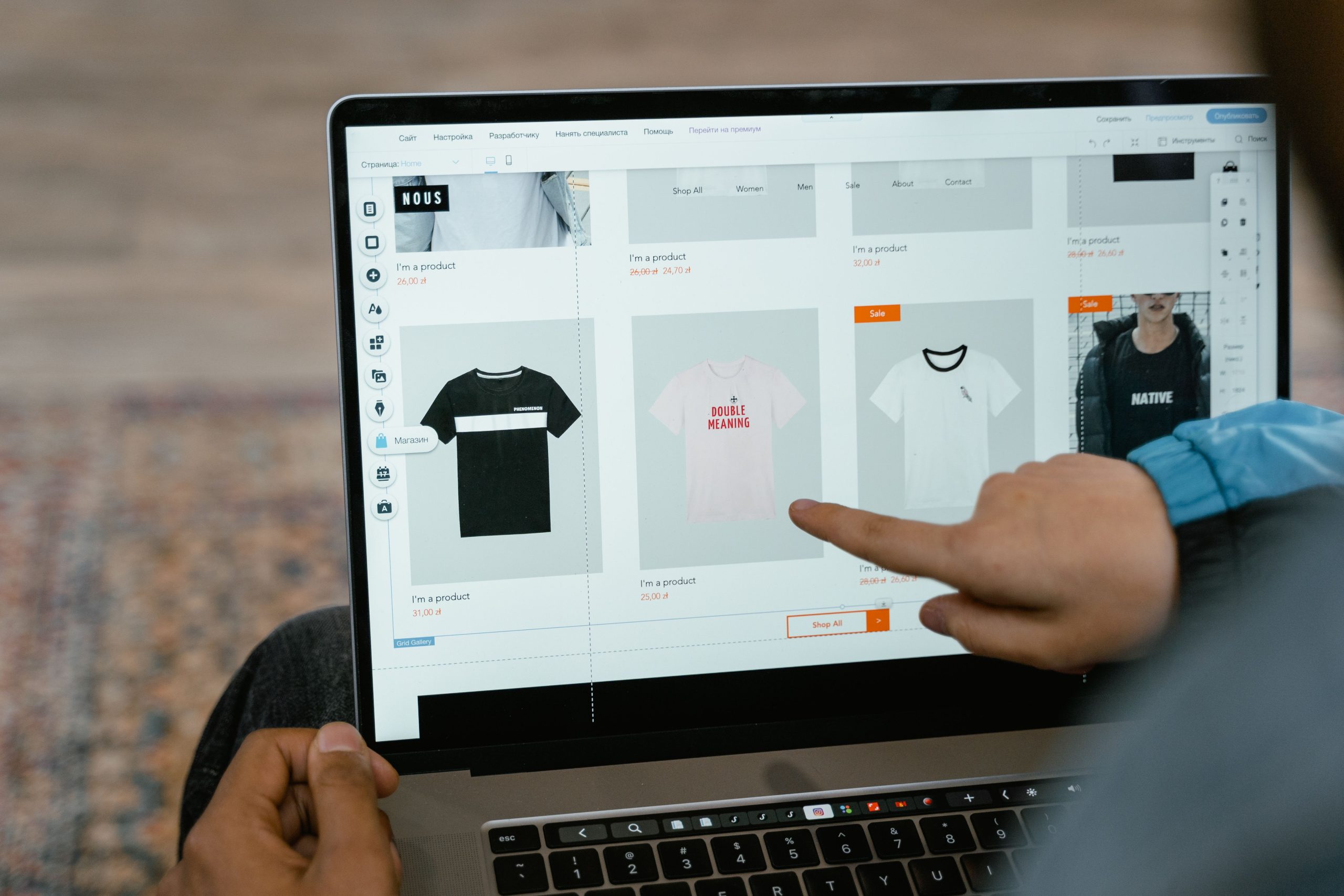
Claims carry much more weight with proof. You can do this by strategically placing testimonials, quotes, real-life results, certifications, and study results near any claims that you make.
Think of this sequence: Promise → proof → next step
As opposed to: Promise → a different section → proof the reader may never reach
If you say your apparel is made with organic textiles, slap a little certification badge near the copy with the statement. If you claim your denim has flawless fits, add a little customer review that confirms this statement nearby.
7. Handle objections before they interrupt the decision
A product may look great on paper, but that’s usually not enough for someone to immediately commit. Think about what could make the reader hesitate before purchasing. They’re probably asking questions like:
– Is this suitable for me (my body/lifestyle)?
– What exactly will I receive?
– Does it ship to my location, and if yes, how long will it take to reach me?
– Will I be able to return it if it doesn’t work out?
– Will I be able to easily use this?
– What makes this different/better than the alternative?
There are a lot of ways to answer these questions, including adding sections within product pages or CTA notes, designing comparison charts that can be used on your website or in marketing campaigns, building FAQ sections or pages, highlighting testimonials, adding micro-copy to the checkout page, or developing specified email marketing or social media campaigns.
Think about where the objection is most likely to arise, and place your copy accordingly.
8. Make the most important information easy to scan
Placement and readability go hand-in-hand. Key information should be highly visible, and it should be presented in a way that’s easy to scan. You can do this by using:
– Descriptive, benefit-led headings
– Short paragraphs
– Bulleted lists
– Highlight boxes
– Images with supporting copy
Also be sure to use a legible font in a colour that contrasts against the page’s background. Avoid dense text blocks that overwhelm and strain the eyes. The right information should be clear and easy to see from the get-go.
9. Adapt the placement to the medium
Copy placement matters in every medium.
On a homepage: Use the hero section to clearly explain your brand’s purpose, ideal customer, and USP. You can also use your homepage to show off your best-selling products and/or relevant offers.
On a product page: Highlight the benefits (in relation to the features), explain who the product is made for and what situations they could use it for, show some social proof, and tell readers everything they need to know about variations, price, shipping, delivery, and returns.
On a service page: Explain how it solves a problem, share the specific outcomes, deliverables, process, timeline, investment, fit, and the steps needed to be taken by the reader.
In an email: Include enough context for readers to understand the offer without assuming they’ve read other emails. Lead with the strongest benefits, add in supporting information (even if it’s repeated), and give a specific CTA.
On social media: Lead with a hook and communicate the core message early on. Don’t rely on the final slide or sentence to share the key concept of the post.

A quick website copy audit guide
Think your copy placement could use some work? Use the following questions to review your website, email flows, or any other piece of copy you think could perform better:
- Can the reader quickly understand what is being offered?
- Is the main benefit immediately visible?
- Are features connected to meaningful outcomes?
- Does the reader receive practical information before being asked to act?
- Are timelines, costs, and conditions clearly defined?
- Is proof located close to the claim it supports?
- Are common objections clearly addressed where they are likely to arise?
- Can someone find essential information while scanning?
- Does the CTA have enough surrounding context?
- Is any important information technically present but practically hidden?
Website copy services for fashion & lifestyle brands
Still need some help with your website copy? Whether you want a more specific audit or you know your words could use a makeover, I can help. Learn more about my fashion & lifestyle SEO copywriting services here, or drop me a line if you’d like to chat directly!